I don't like the new Google Pay, but it could be Google's next killer app
Google Pay is now over half a dozen apps in one.
If there's one thing that Google's proven to be consistent at over the years, it's the company's need to constantly change and update its apps/services. Whether it be shifting the placement of YouTube comments or ushering in gaudy new logos for G Suite, there's always something being tweaked.
We saw another prime example of that last week with the major redesign that came to Google Pay. It's actually more than a redesign, though, and more like a completely different app altogether. Where the old Google Pay was just used for paying at stores and sending money to friends, this new version bundles that with brand new features and a fresh app layout. Complaining about change just for the sake of it isn't productive, but after playing around with the new Google Pay app for a few hours, I can't help but feel hesitant about this new direction Google is taking.
The best way to think of the new Google Pay is like a smorgasbord of every money app you've ever used. Seriously, all of them. You can:
- Send money to friends (Venmo/Cash App)
- Pay at stores using NFC (Apple Pay/Samsung Pay)
- Link your bank accounts and cards for financial guidance (Mint)
- Add cashback rewards to your cards (Rakuten/Dosh)
- Create a bank account with Google Plex in 2021 (Chase, Bank of America, etc.)
- Order food and pay for gas/parking (DoorDash, Shell, ParkWhiz, etc.)
On the surface, combining all of these things into one central application sounds like a great idea. Instead of juggling between multiple apps for checking your account balance, getting guidance on your spending, and sending money between people, you can do all of that in one spot. In its current state, however, Google Pay just feels half-baked.
Google Pay now has three main screens — each of which serves a very different purpose.
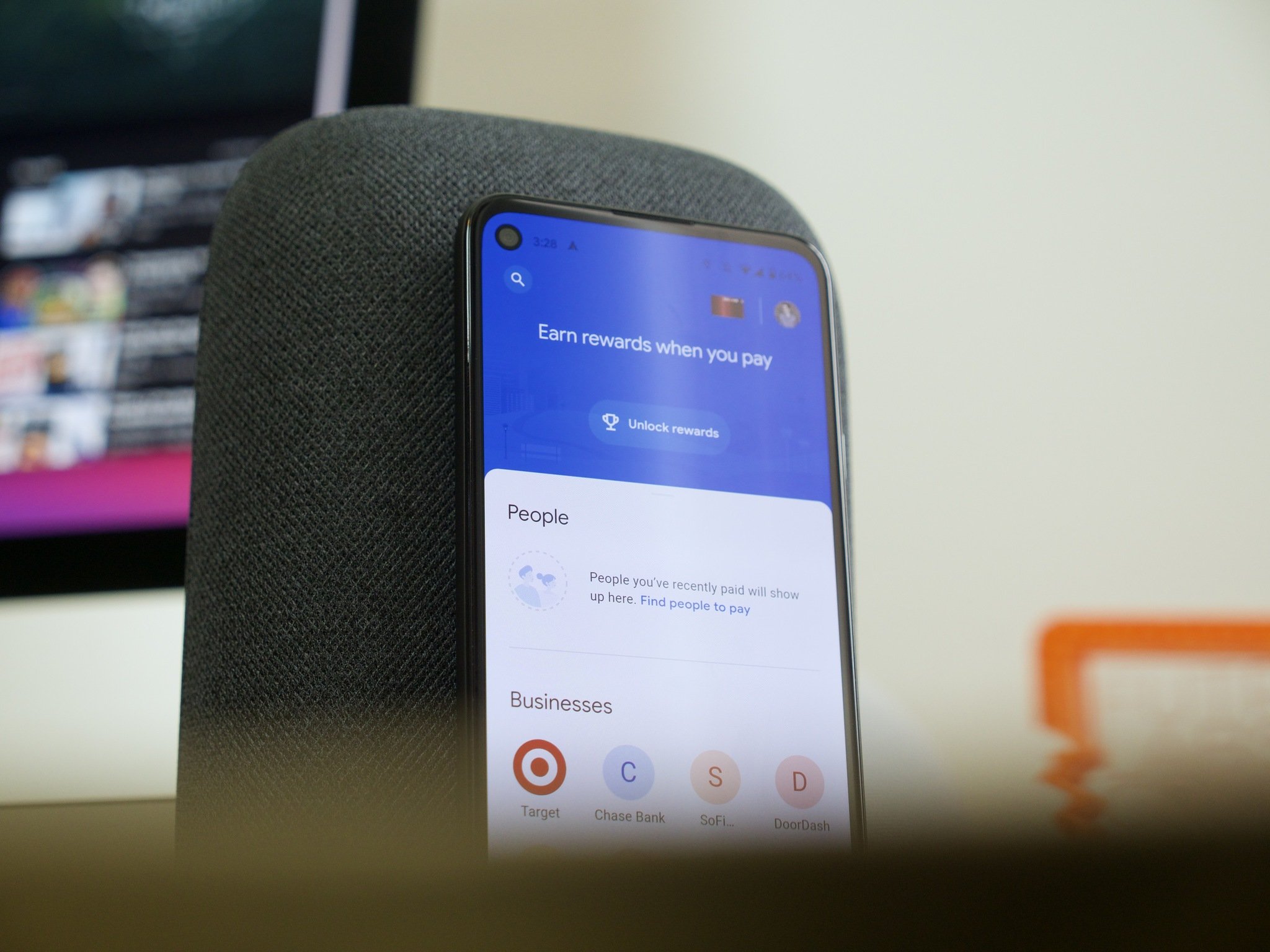
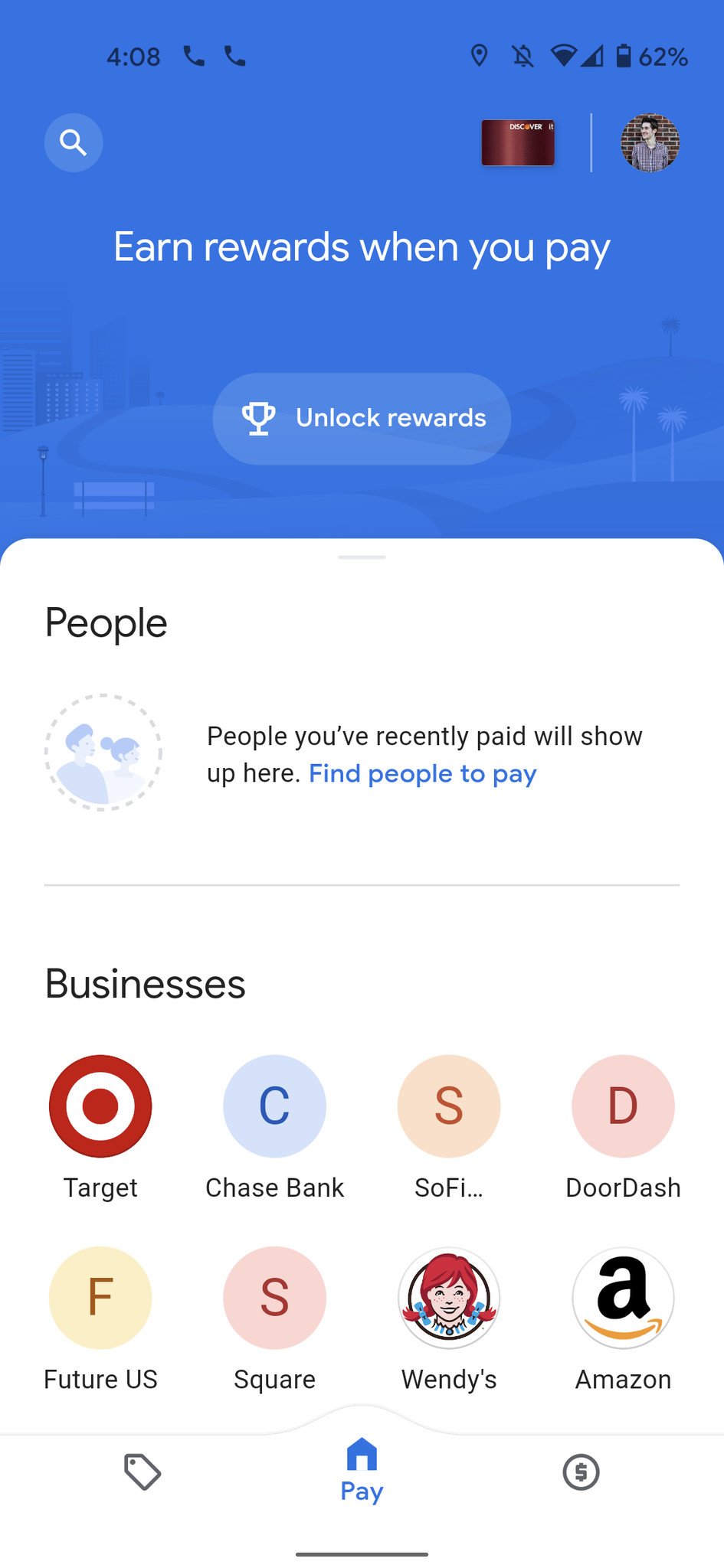
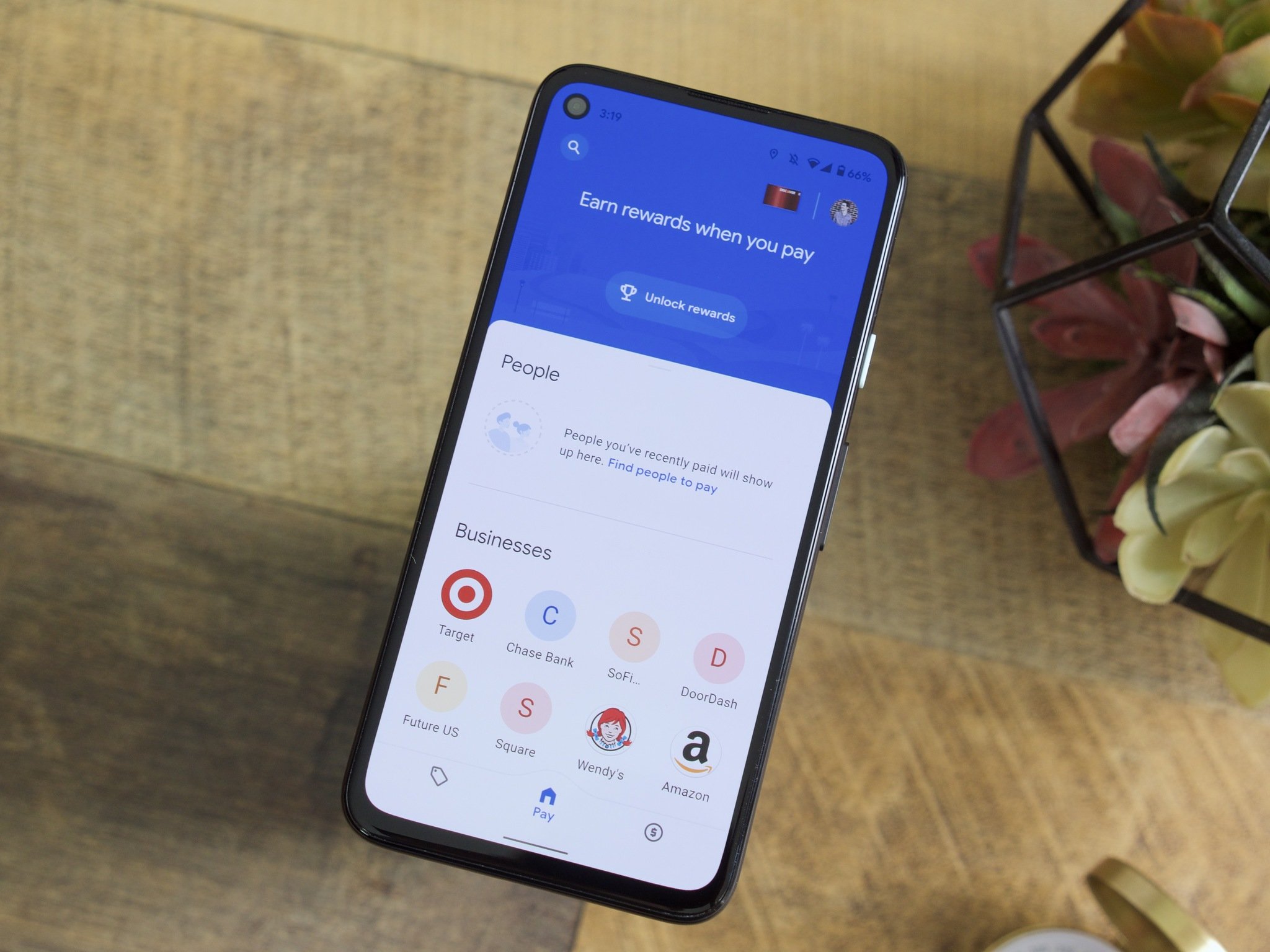
It all starts with the Google Pay home screen, which is officially the "Pay" page. The idea is that this is the section of the app based around sending/spending money, but that's only mostly true. The People section will show contacts you can send money to, with the Discover section at the bottom allowing you to order food, get gas at a gas station, and pay for parking.
In the middle of those two sections is Businesses, which shows a history of transactions from your most-frequented places. You'd think this would be better suited for the Insights page, but for whatever reason, it's here instead.
Furthermore, Google seems to have placed considerably less emphasis on showing your cards for contactless in-store payments. Where this was a main focus for the old Google Pay, viewing all of your cards/passes is now done by tapping the small icon for your default card in the upper-right corner. If you don't tap the card exactly right and accidentally tap the blue background surrounding it, you're instead shown your reward status for sending money to friends. I've done this countless times in my testing of the new app, and it's never not annoying.
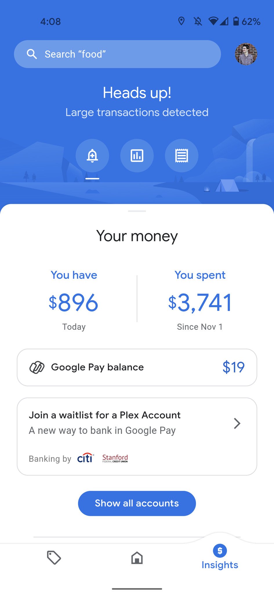
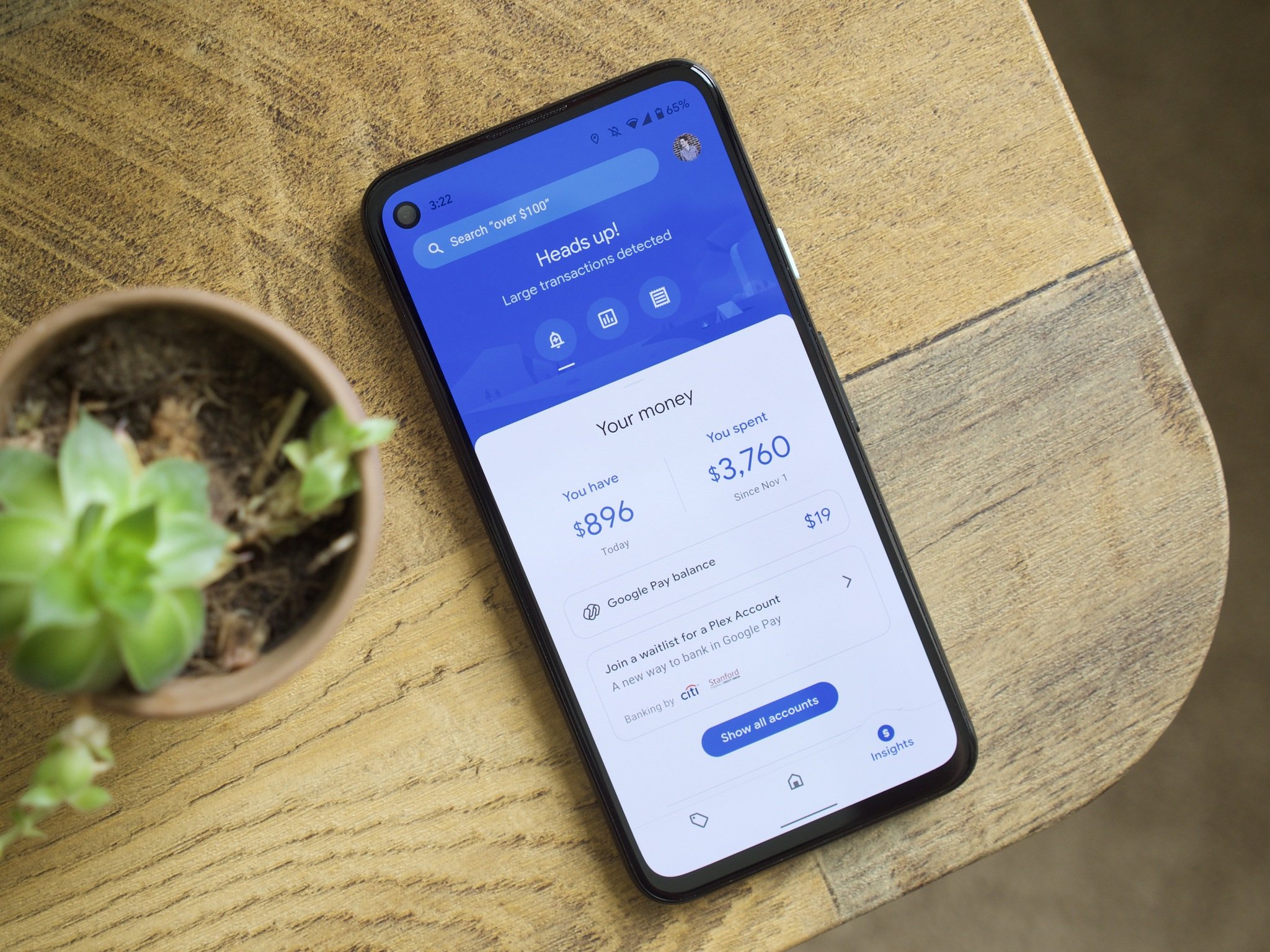
Speaking of the Insights page, this is one of the biggest new additions to Google Pay. It's a place where you can link your external bank accounts/credit cards, and in doing so, get an overview of your saving and spending across all your accounts. The problem, though, is that it's incredibly limited in its current form. Google shows you how much money you have, how much you've spent, and a history of all your transactions. Outside of that, there's not much else to see.
Compared to one of the most popular personal finance apps, Mint, there's a ton of functionality that's missing. You can't create budgets, manually add bills, create goals for paying off debt, or anything like that. It's a very incomplete attempt at recreating what other apps do infinitely better, and seeing as how Google is using Plaid for linking your accounts, it's pulling in the same exact info its competitors do — just with less information/features around it.
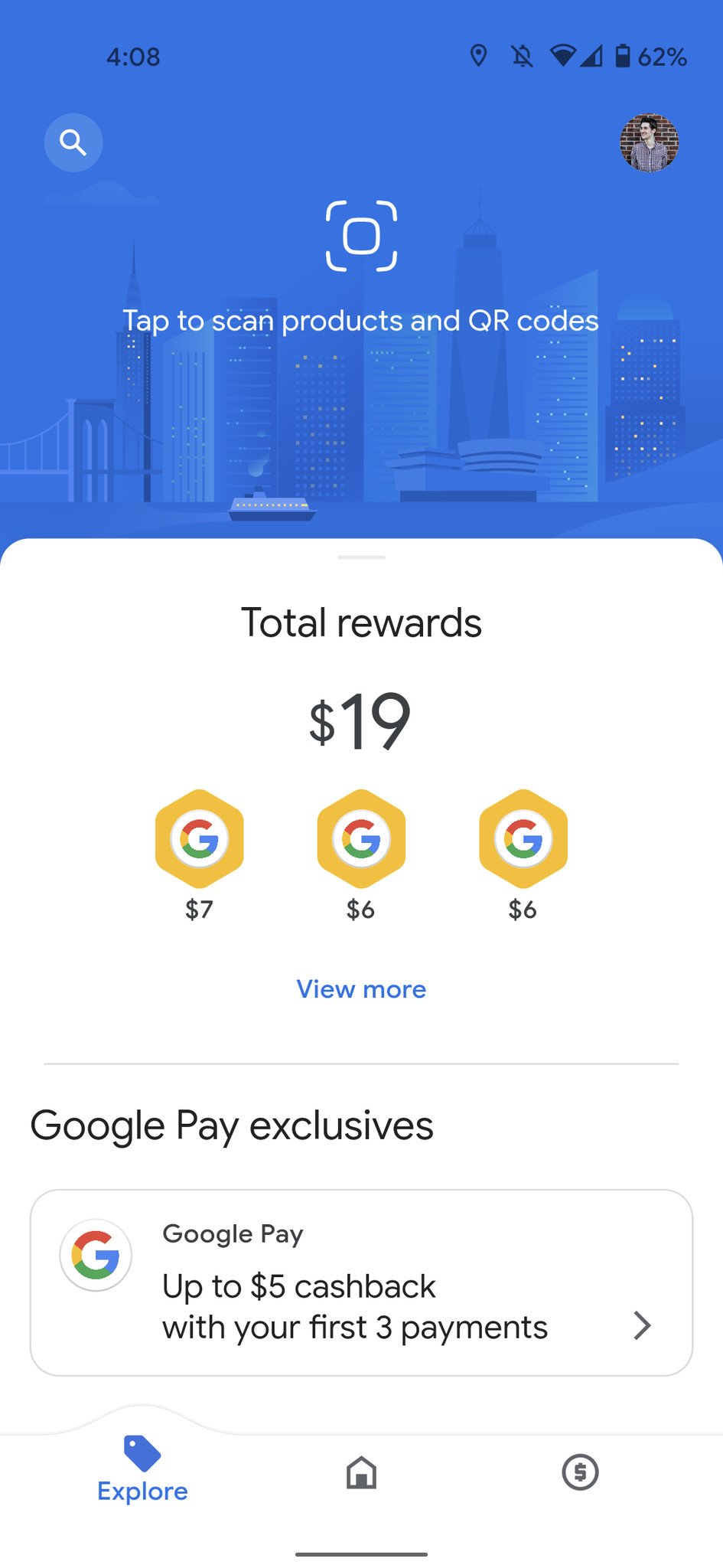
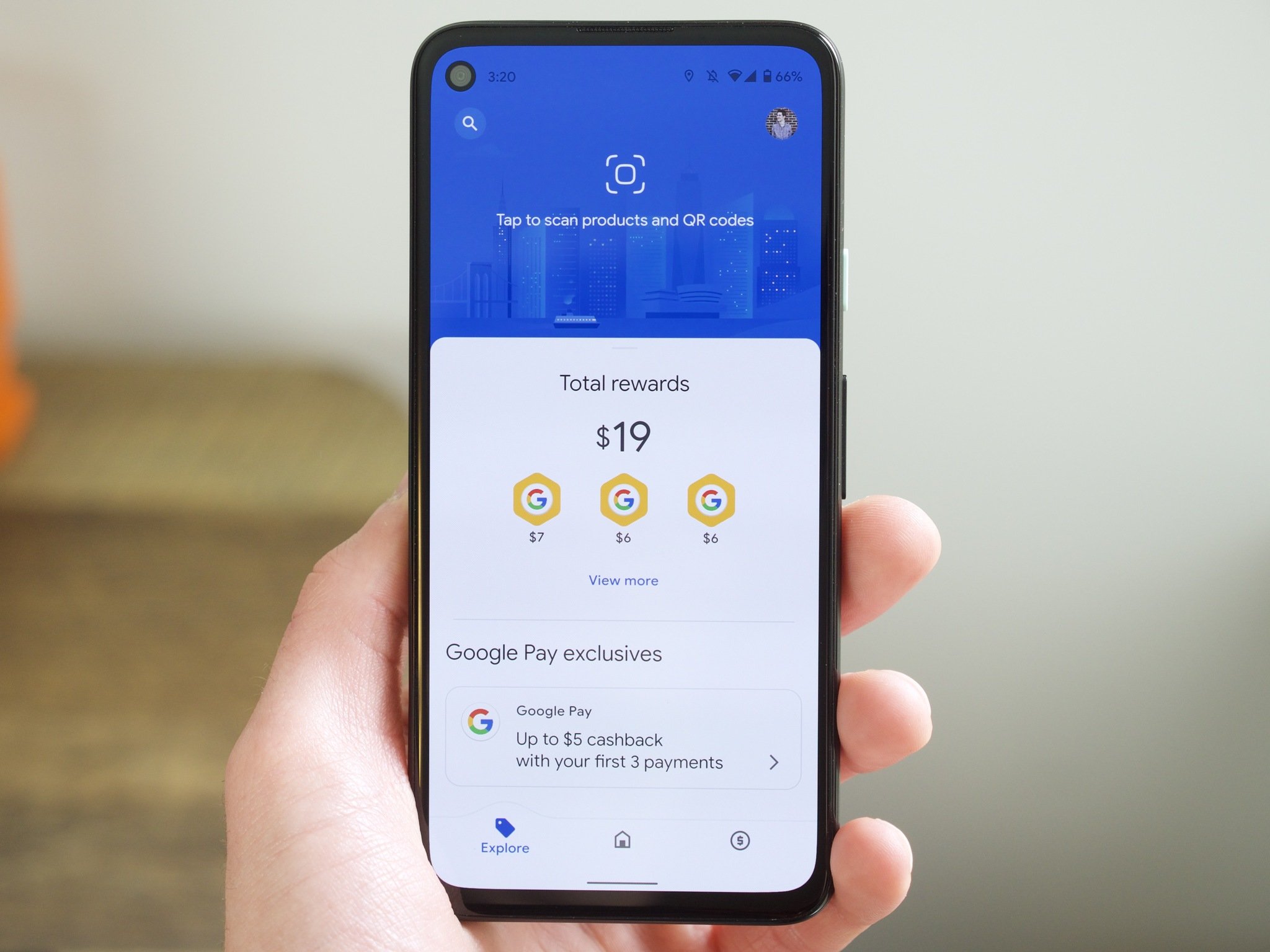
And, finally, we have the Explore page. This is where you can find cashback offers that are either available online or can be linked to your credit/debit cards, but similar to Insights, it feels like a worse offering of what you can get with other apps.
The offers themselves are...fine. You can get 1.5% cashback on PetSmart and 2.5% on Macy's, but it doesn't take long to find better deals elsewhere. Looking at my preferred cashback app, Rakuten, I can score 4% cashback on in-store PetSmart purchases and a whopping 10% if I shop online. Rakuten has a better offer for Macy's, too, advertising up to 6% cashback for most departments.
The retailers currently available with these Google Pay offers also leave a lot to be desired. Many of them are niche brands such as Porsche Design and Johnston & Murphy, whereas I can hop on Rakuten and get deals from Walmart, eBay, Target, Overstock, Groupon, and countless others. And that's not to mention the layout of the Explore page, which is just a vertically-scrolling list of available deals with a confusing search function and poor categorization.
All of this results in me not enjoying the new Google Pay as much as I did the previous version, but I can see a future in which this becomes one of Google's killer apps. If more personal finance tools are added, Google can onboard more brands for better cashback offers, and some of the app's design quirks can be corrected, Google Pay could be the one-stop-shop for all things money and finance. The problem right now, though, is that we're very much not there yet.
Like a lot of things Google launches, Google Pay feels like it's barely a finished product. There are a lot of exciting ideas here, but we've yet to see them truly fleshed out. I really hope Google Pay is as big for Google as Google Photos is today, but we're going to need a few more updates before we reach that point.
If and when we do, though, it could be pretty magical.
New way to pay
Google Pay
Step aside Mint, Rakuten, and Venmo
The new Google Pay has arrived, and even though it has a few rough edges, Google's on to something special. If you want one app for sending money to friends, earning cashback offers, and monitoring your personal finance, that's what Google Pay strives to do.
from Android Central - Android Forums, News, Reviews, Help and Android Wallpapers https://ift.tt/33cdiki
via IFTTT
No comments: