Samsung One UI 2.0 review: The best (and worst) Android 10 features
This is undeniably still 'Samsung' software, with the latest standards from Google baked in.
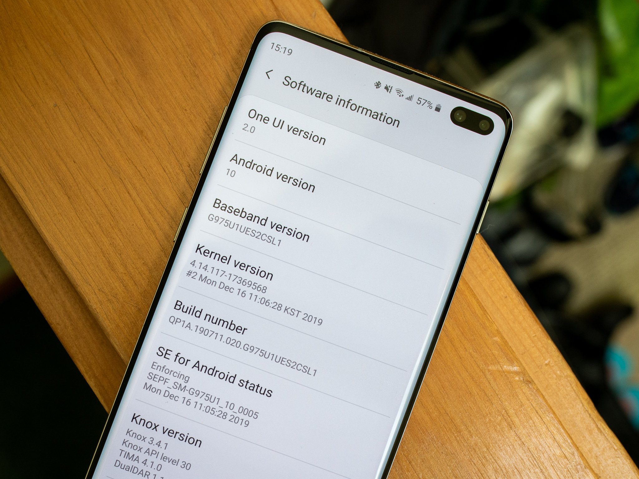
One UI 2.0 isn't a big update when you consider that it doesn't have many visual changes, but it includes a ton of features that were introduced in Android 10, including important changes to permissions, notifications, dark mode and more. Samsung also took the opportunity to make a few subtle interface tweaks as well.
The update started rolling out at the start of 2020 for the Galaxy S10 series, and was installed out of the box on the Galaxy S20 series. With millions of Galaxy phones around the world now running One UI 2.0, here's everything you need to know about the update.
Samsung Galaxy S20
$850 at Amazon $850 at Samsung
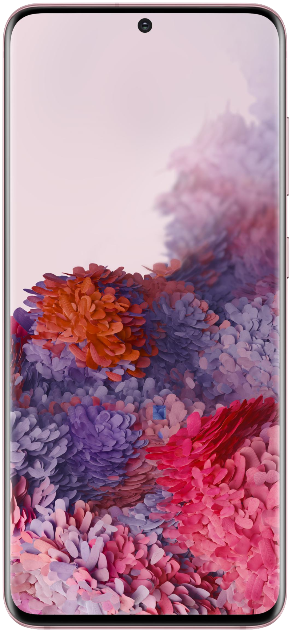
The Galaxy S20 is packing all the features that you care about. The 120Hz AMOLED screen makes it an absolute joy to use the phone, and under the hood you'll find the latest internal hardware. The camera at the back has been overhauled and now comes with 8K video recording, and you get a massive 4000mAh battery.
The Android 10 basics are implemented properly
Android 10 isn't the biggest update we've seen, but makes a few important changes to the experience of how every person uses their phone every day. And Samsung did a really good job integrating Google's platform changes into its own system without feeling tacked on or out of place.
Samsung did a great job implementing Google's platform changes without feeling tacked on.
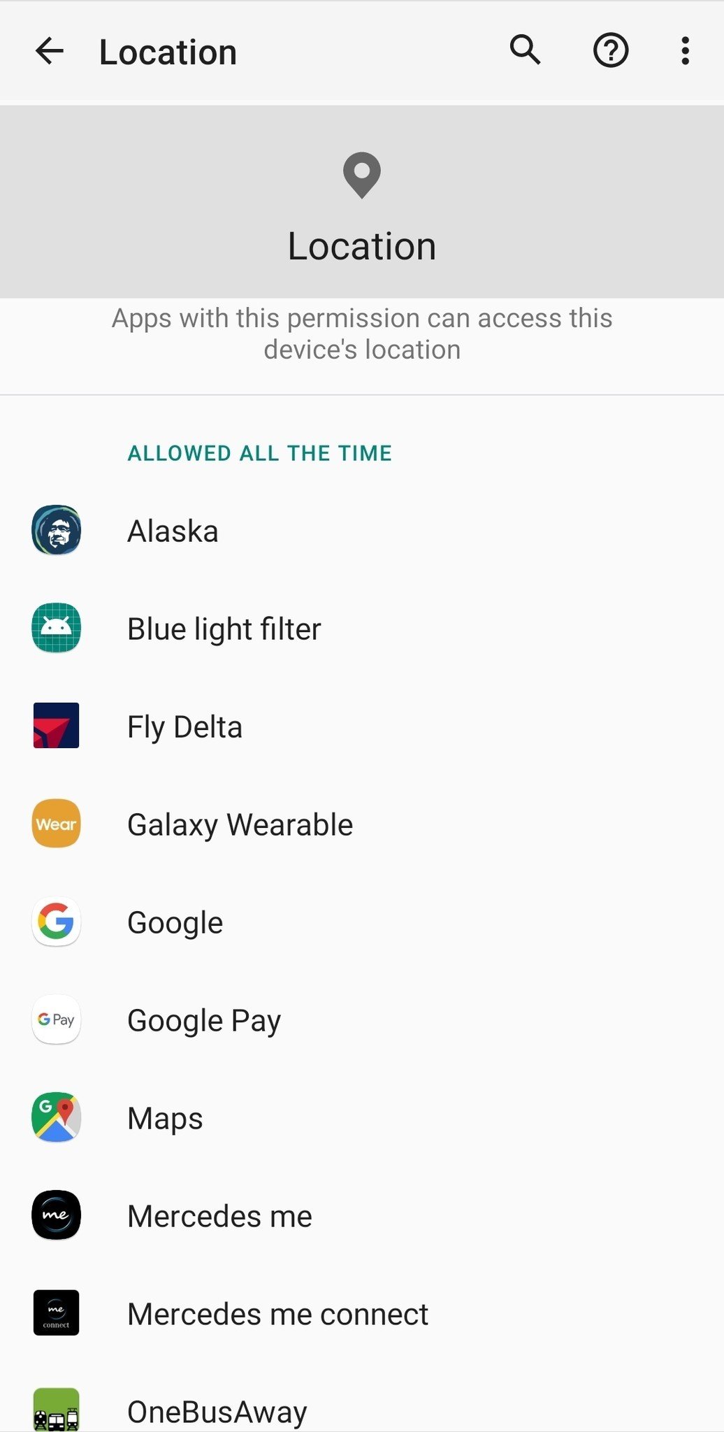
The biggest change in my eyes is the location permission model, which now lets you manage which apps can have access to your device's location — and have the crucial middle ground of "only while using the app." Samsung's implementation is the exact same as you'd find on a Pixel 4, including giving you reminders when apps have been given your location in the background with a quick option to restrict that.
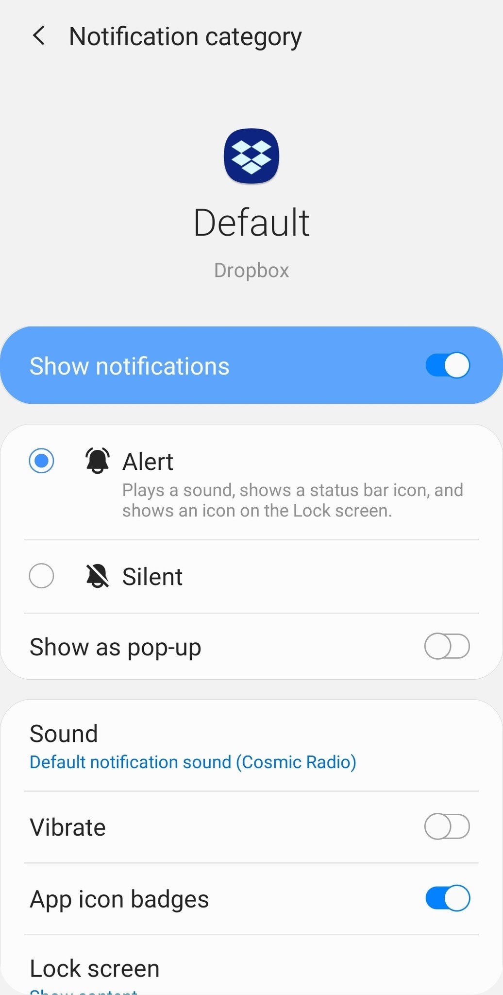
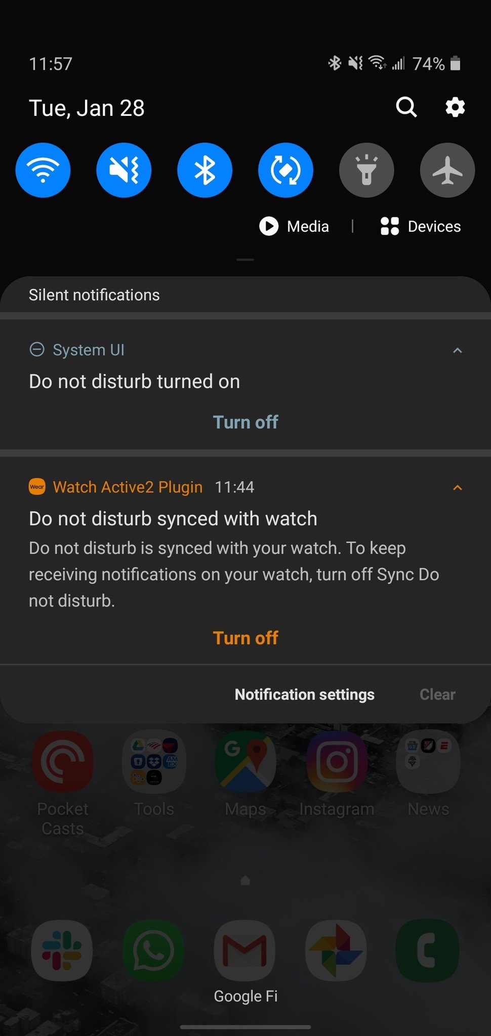
Android 10's notification management has also been carried over whole cloth, giving you better management of individual notification categories in each app. This still necessitates some micromanagement of each app's notifications to get things just right, but the way Android 10 does it straight from the notification shade makes it as easy as it can be right now. And being able to explicitly silence low-priority notifications to show separately in the notification shade makes the management worth it.
Samsung has also thankfully ditched its own dark mode implementation in favor of leaning into Google's. That doesn't make a difference for Samsung's own interface elements, which all look the exact same in Android 10's dark mode as they did in Android 9, but it really matters for third-party apps and widgets. With the proper Android 10 dark mode enabled, you get an immediate flip to the dark mode version of any app or widget that properly targets Android 10 — that means no random jarring switches to bright interfaces.
Figuring out Android 10 gestures with a curved screen
The only part of the core Android 10 experience that's been a bit of a mixed bag is the new gesture system. One small peeve is Samsung for whatever reason chose to have the phone vibrate anytime you use a gesture, which is unnecessary and a little annoying considering the Galaxy S10's less-than-stellar haptics. But functionally, the issue to note here is how the side-based back gesture system combines with Samsung's aggressively curved screens.
The curved screen edge can make it tough to land on the actual edge of the screen as far as the software is concerned, which takes a lot of getting used to. But more frustratingly is what the back gesture zone does to your ability to slide in an edge drawer in an app, which has an even smaller detection area. It's particularly tough when you're using the phone in your right hand and trying to swipe in that drawer on the left — I basically have given up at this point and use my left hand to do so.
Unfortunately, Samsung can't do much to fix this situation — there isn't much that can be done to defeat the physics of that curved edge. It gives you the choice of using traditional back/home/recents buttons, or Samsung's pre-Android 10 bottom-bar gestures, if you'd prefer to use either of those to solve the problem. And if you do choose Android 10's gestures, you can adjust the sensitivity of the back gesture — meaning you can make the system register an edge swipe as a "back" gesture easier, but this only helps with the back gesture, and leaves the slide-in drawer issue just as bad (or worse) because its recognition area is still incredibly small.
It's something you can get used to, just like any other muscle memory change — like never touching the Bixby button, for example — on a new phone. But even after weeks of using my Galaxy S10+ on One UI 2, I still struggle to consistently get the gesture I want on the first try.
It's still Samsung software — for better and worse
The biggest thing that will hit you when you update a Samsung phone to One UI 2 is that ... nothing really changed visually. As noted, Android 10's most notable changes are more in the experience and individual features instead of sweeping interface changes. And Samsung didn't use this update to make any big design or feature changes of its own, either.
The biggest thing you'll notice is that the general design is unchanged from Android 9.
There are subtle changes to the lock screen and always-on display, with new options to tweak the look of both. That includes getting fresh photos on the lock screen every time you turn on the screen, and better customization options for the always-on display style. And the confusingly-named "edge lighting" (which actually includes notification pop-ups) has been expanded with its own set of customization options and support for just about every app you'd want.
Nobody should expect this sort of update to bring sweeping camera quality improvements, but Samsung did make a couple changes to the camera app that improves the overall experience. You can customize the main interface by choosing which camera modes go in which places, making it easy to swap between your most-used modes while hiding things you'll never use. You can also now use the dedicated night mode with all three cameras, which is at least a small improvement to the overall experience even though Samsung's low-light quality itself isn't stellar.
There are still a lot of ways that Samsung could stand to modernize its software.
There are still a lot of ways that Samsung could stand to modernize its software, even though its interface is actually running on the latest platform version. The One UI 2 launcher still feels stuck in the past with overdone animations and clunky folders, its notification shade is a bit too spaced out with unnecessary interface elements, and you can still get stuck in multiple levels of settings pages just trying to get simple things done.
This is both good and bad, of course, because nothing can be simple when it comes to supporting a customer base this large. Samsung has to balance making improvements, which are ostensibly providing ongoing value to customers who crave getting the latest and greatest, while not rocking the boat too much for the general consumer who just wants their phone to keep working the way they expect. Hopefully a forthcoming smaller update that brings the visual changes and features launched with the Galaxy S20 can provide a nice addition to the underlying changes made in this One UI 2 release.
Battery life and performance don't take a hit
I've had a mixed history with Samsung software updates, having dealt with some that really mess with the phone's performance. A couple times the situation was bad enough to require a factory reset to sort out, which is never a fun process. Thankfully, that hasn't been the case (so far) with my Galaxy S10+.
It's always a relief when you can apply a full platform update with no ill effects.
This isn't a fresh-out-of-the-box phone, either — I've been using this GS10+ for months, and I haven't factory reset it once since getting it nearly a year ago. Even with dozens of apps installed and all of my data, the One UI 2 update slotted into place perfectly with no noticeable impact on performance or battery life.
Of course this is what you'd expect to happen, especially with a latest-generation phone, but I'm still happy to report anytime I can apply a full platform update with no ill effects. I know there are big differences in how each person has their phone set up and which apps they have installed, but I hope my experience is representative of what everyone else experiences.
One UI 3.0 is coming very soon
Samsung is now readying the One UI 3.0 update based on Android 11. One UI 3.0 promises to deliver a host of new features and tweaks to the UI, and it will offer all the new features in Android 11.
With Samsung now committing to three Android version updates for its flagships and select mid-range phones, more users will be able to receive updates for longer. If your phone is running One UI 2.0, it is likely to receive the update to One UI 3.0 once it becomes available in a few months.
Get More Galaxy S20
Samsung Galaxy S20, S20+ & S20 Ultra
from Android Central - Android Forums, News, Reviews, Help and Android Wallpapers https://ift.tt/2Sgatsv
via IFTTT
 Reviewed by site
on
September 19, 2020
Rating:


No comments: