iOS 14 widgets make Android's look like an absolute embarrassment
Google needs to set a proper example for widgets or it needs to hire someone who can.
I've been theming my Android phones since before I knew what widgets even were. While Android home screens have continually evolved — launchers have continued to improve and icon packs get bigger and better — there's one aspect of the home screen that has remained painfully, abominably stagnant: widgets.
Widgets offer up amazing utility and potential for customization, but only if app developers actually take the time to make them functional, scale-able, and beautiful.
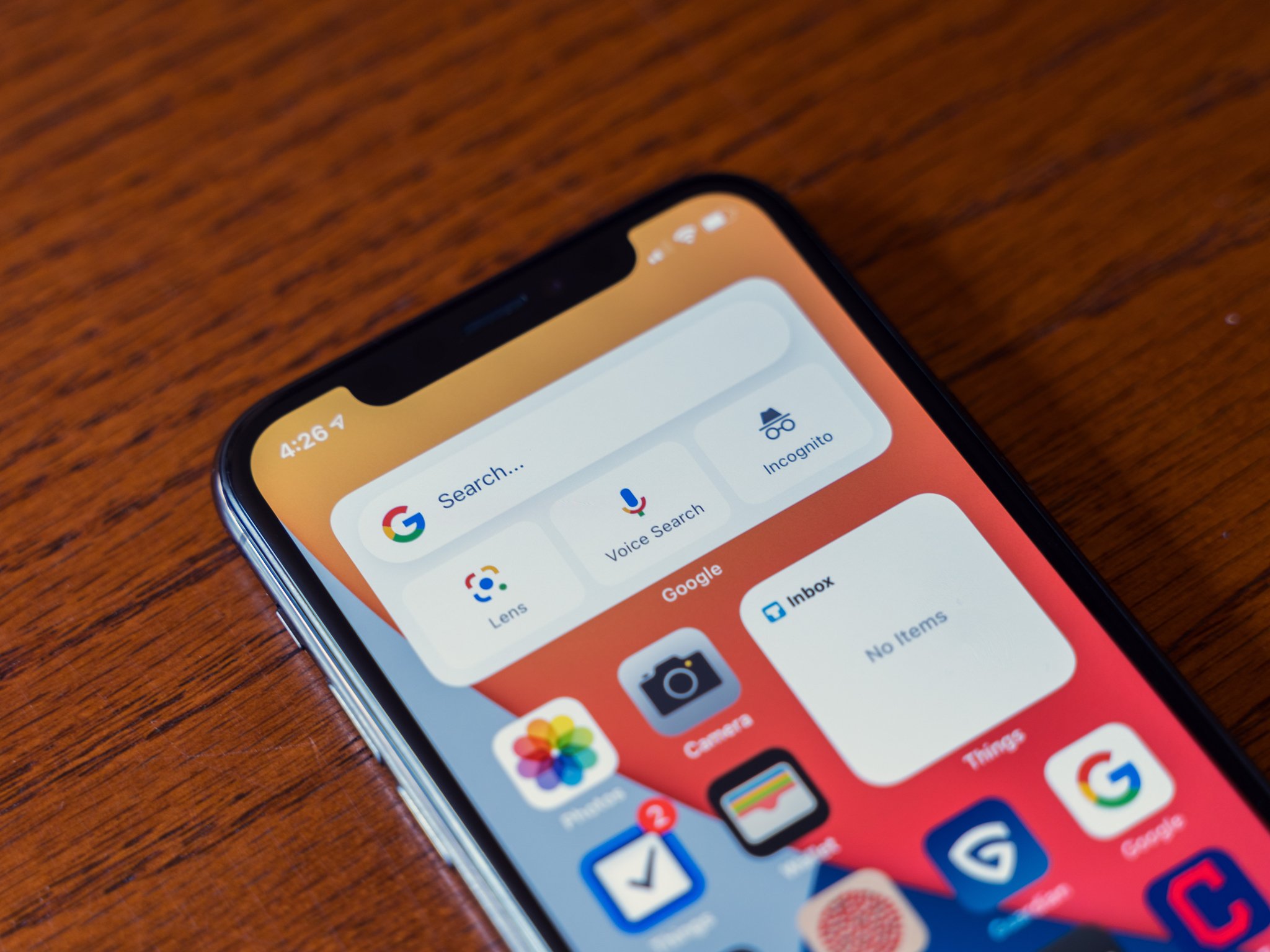
I had hoped back in the spring that iOS 14's widgets would spur Android widgets forward, that this would remind developers and Google itself that widgets can get great when done right. Well, summer has passed, iOS 14 is finally here, and what do we have to show for it? Proof positive that Google cares more about widgets on iPhone than Android.
It’s very Google to make a nicer widget for iPhone than the one that’s on Android and Pixels. pic.twitter.com/wzMHZFCT0R
— Chris Welch (@chriswelch) September 17, 2020
Android has had home screen widgets for a decade, and they've been surpassed by iOS widgets in a single day. A single day. This isn't to say there aren't beautiful widgets out there, because there are, but the fact that good widgets almost always come from third-party widget makers rather than from app developers — and almost never from Google itself — is an absolute embarrassment for the platform.
We now know Google can make widgets that look good, widgets that don't look like they were dropped out of 2014. Like so many areas of Android, however, Google chooses not to put forth a clear standard, refuses to lead by example. Just as Google itself fails to optimize most of its apps for tablets and Chromebooks, Google's widgets are all old, clunky, and not well optimized. Arguably the best widget Google makes is the At A Glance widget, which was made for Pixels in 2016 and added to all other Android phones in 2018.
Android has had home screen widgets for a decade, and they've been surpassed by iOS widgets in a single day.
Google's Calendar widgets haven't changed in years. Google Chrome's widgets haven't changed in years. Hell, the widget for Google Books is from 2012, and I get flashbacks to my Nexus 7 tablet every time I look at it. Even YouTube Music's widget — which was added only last fall— looks like it came from the Holo era: it doesn't resize, it's not color responsive, and it's even in that same dark grey of 2013-era Android.
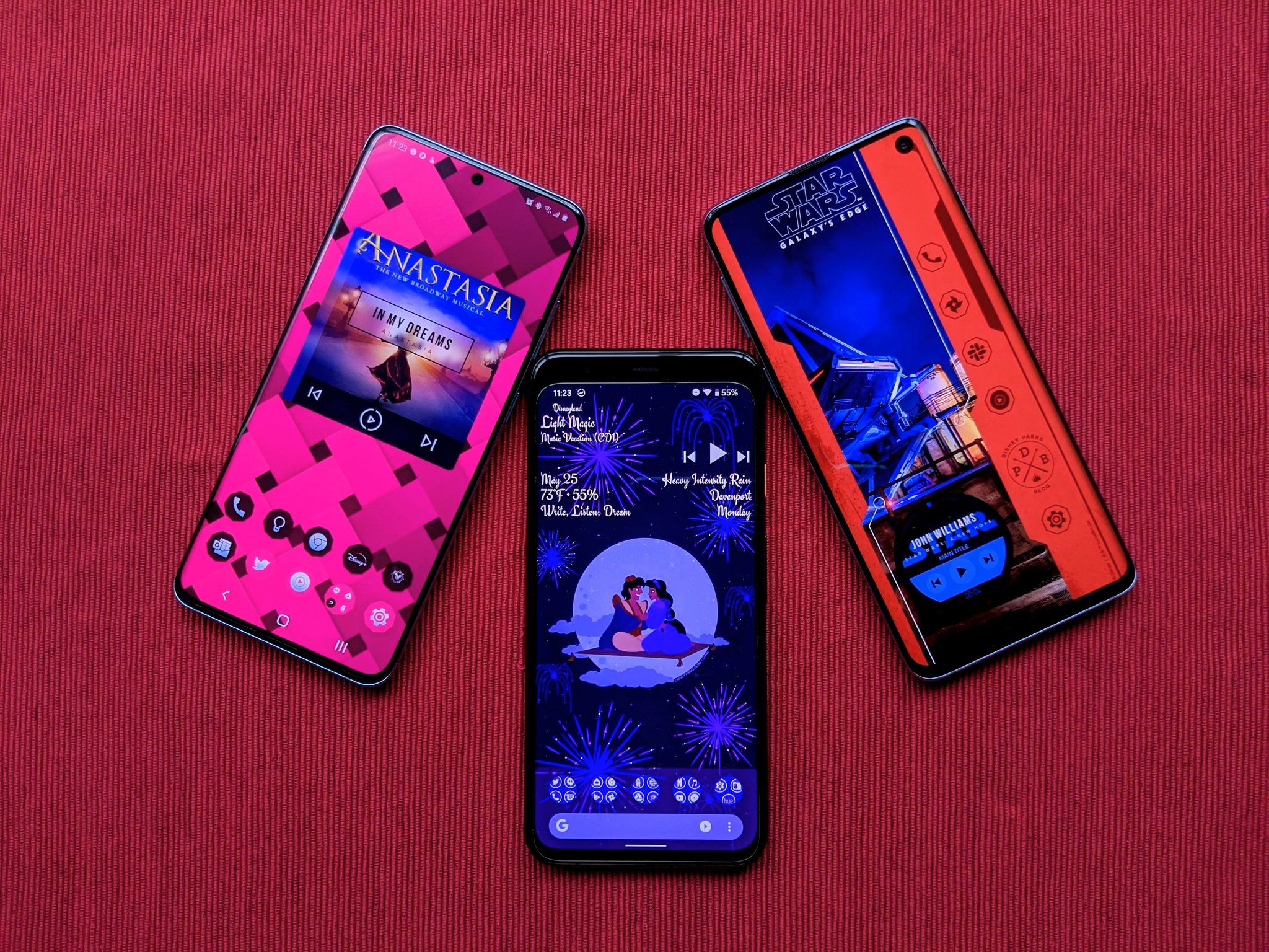
We know Google has the capacity to give us more colorful, more responsive widgets. We know this because the persistent notification for playing music — which got another upgrade in Android 11 — pulls colors in order to provide a vibrant, adaptive media experience. We know this is something that could be done with widgets just as easily at the notification, because you can do it with KWGT right now.
Google tries to be the design standard-bearer for Android. Every year, it tries to get Android more consistent and user-friendly, and yet time and time again, the company's own products don't follow suit. Google rolled out Adaptive Icons back in 2017 with Android Oreo, and three years later, not even all of Google's own apps use them, to say nothing of millions upon millions of app icons that do only the bare minimum to meet Google Play requirements.
Imagine how wonderful Android home screens could look if Google gave Android widgets half the attention to detail that Apple did. Imagine how much better the Android app experience could be on Chromebooks and Android tablets if Google gave half the dedication to large screen optimization that Apple did.
Now burn that dream into your mind, because it's never going to happen under Android's current leadership. At least we have KWGT to pick up Google's slack, if you're willing to build it yourself.
from Android Central - Android Forums, News, Reviews, Help and Android Wallpapers https://ift.tt/3mDOaLy
via IFTTT


No comments: